Web UX / UI Rebranding
A redesign that’s cherry pickin’ good
- Client
- Pop Corals
- Project year
- 2022
- Role
- Lead UX Designer
- Tools
- Figma · Adobe XD
Work / Pop Corals, Brooklyn
A redesign that’s cherry pickin’ good
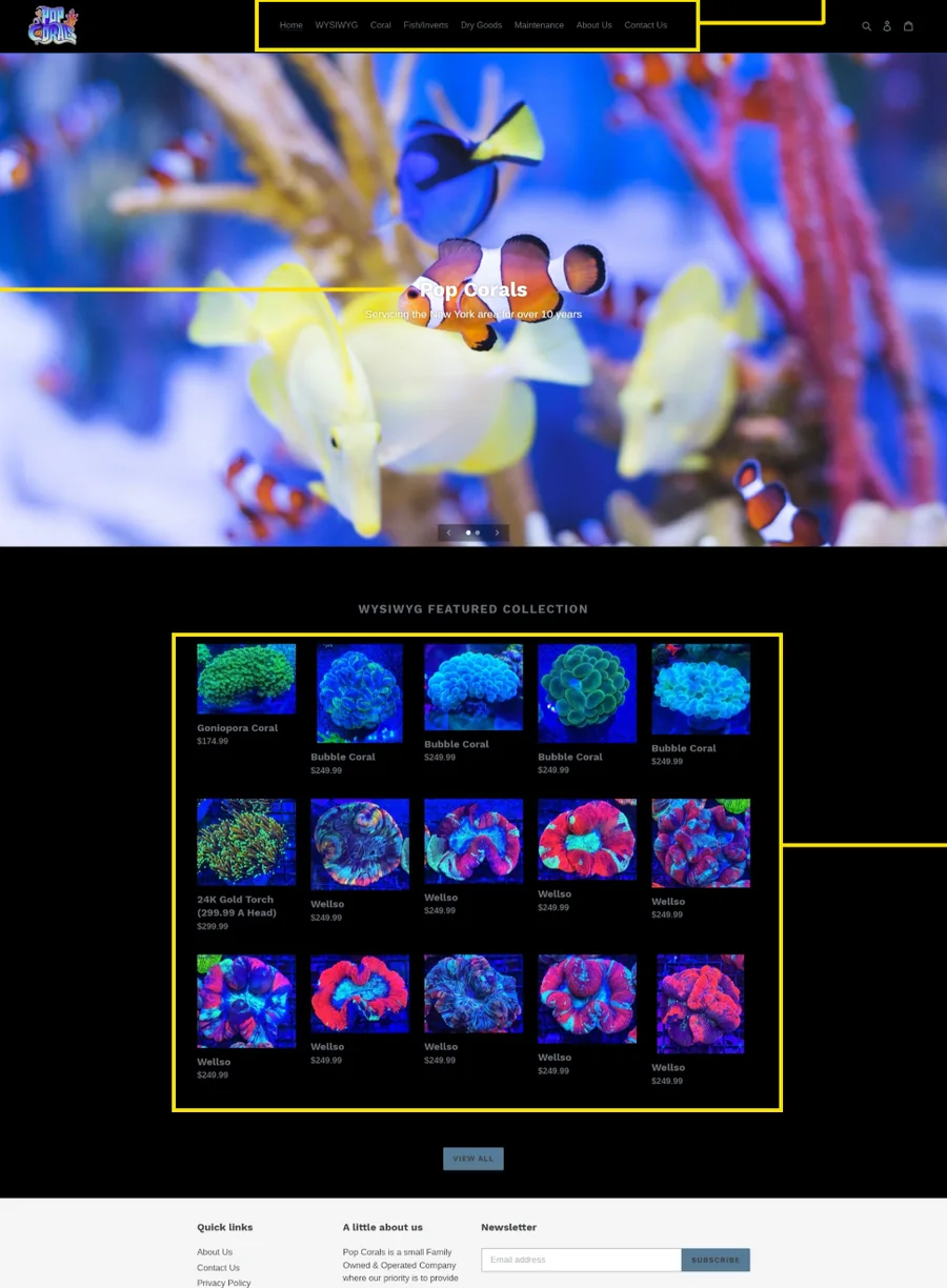
A one-week rebrand and storefront redesign from 2022, set here against the Pop Corals storefront as it stands today.
A redesign that’s cherry pickin’ good
Where the brief came from
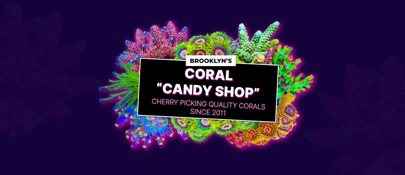
Visually impactful with a ‘POP’ of color. That’s everything the original Pop Corals website was missing. Pop Corals is known in the reef keeping industry for being bold, in-your-face color when it comes to the coral they offer — so why wasn’t it being represented on their site?
The COVID-19 pandemic threw its set of challenges at traditional brick-and-mortar storefronts, creating an ongoing need for engaging web experiences that would capture the customer in the same ways in-person shopping did before the pandemic.
An engaging, measurable e-commerce experience letting new and existing customers buy fish and coral without leaving home — without detracting from the in-person experience existing customers were accustomed to.
User interviews
How people prefer to shop for aquarium livestock, who they shop with when they make that decision, and how often they order from a phone.
User research was conducted in two phases, each round consisting of five users, to gain a deeper understanding of how potential users prefer to shop for aquarium livestock, who they prefer to shop with when making livestock purchase decisions, and how often they use their mobile devices to place e-commerce orders.
In the second phase I gained insight into their in-store purchase experiences and how those compared to e-commerce — what barriers prevented them from making in-person purchases, what barriers they hit while buying online, and what motivates those purchase decisions.
I enjoy walking into my local fish store and seeing what’s available. There’s nothing like handpicking fish or coral for your tank.Round 1
There seem to be so many vendors selling fish and coral these days; it’s hard to remember them all.Round 1
It’s hard to source reliable e-commerce vendors who are willing to ship directly to my door.Round 1
I’m new to the hobby but what drew me in was the color. I want that WOW factor when I look at my tank, so the brighter the better.Round 1
Existing customer
“Supporting the stores I know and trust by making local, in-person connections”
Tina is an aquarist, hobbyist and social vlogger working for a non-profit reef restoration project. In her spare time she frequents reefing forums where she finds inspiration for her vlog, as well as local sources of fish and coral for her home aquariums. Highlighting the importance of sustainable reef keeping practices is important to Tina, and building lasting relationships with local vendors is her passion. She is interested in supporting local businesses and willing to go the extra mile to keep their doors open during difficult times.
What she’s trying to do
What would make her buy
Read from her own trait words
What she follows, and what she follows it on
Where the old site failed her
Where she already spends time
New web customer
“I’m looking for a trusted fish and coral supplier willing to ship livestock direct to my door”
Xavier is a saltwater enthusiast who recently upgraded his 55-gallon aquarium to a 250-gallon custom reef tank in his home office. It has been his dream to showcase rare and exotic corals that are vibrant in color and on full display since he first started in the hobby. His location makes it difficult to find consistent suppliers in his area, and he often resorts to forums to swap coral with fellow hobbyists. He finds searching the forums time consuming and a waste of time when looking for specific pieces.
What he’s trying to do
What would make him buy
Read from his own trait words
What he follows, and what he follows it on
Where the old site failed him
Where he already spends time
One buying trip, five stages
The 2022 project ran interviews, personas, an audit and two rounds of testing, but the journey was never mapped. This maps it now: every action, feeling and break point below comes from Tina and Xavier’s own words, and the last band names what the storefront does about it.
Four barriers, in order of damage
Preliminary user testing identified the major barriers existing and first-time users hit on the original site. Feedback was compiled and the main areas of focus were defined through affinity mapping.

I love using this process, and here’s why: it gives the complete picture of every interview, virtual or in person. Compiling thoughts and patterns into something tangible to move forward with is information direct from your users — and what’s better than that?
Low-fidelity first, so the argument is about order, not color
Color, lettering and the pieces they carry
The palette had to be bold, yet warm and inviting — about energy, visual engagement and excitement for the products they offer. Complementary colors with an accent as bold as the brand itself are what let this page POP.
Heading 1: Aa
Heading 2: Aa
Heading 3: Aa
Paragraph 1: Aa — condensed capitals for anything that has to be read across a room, and a plain sans for everything you actually read.
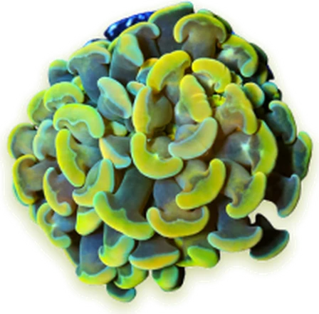
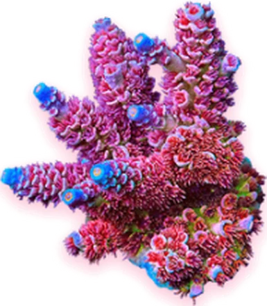
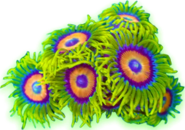
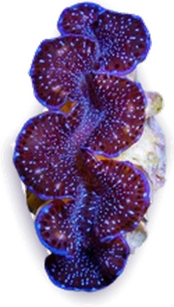
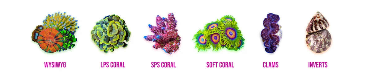
Six categories, each one photographed on white and cut out, so the livestock — not a tile — does the signposting.
WYSIWYG
LPS coral
SPS coral
Soft coral
Clams
InvertsHomepage, top to bottom
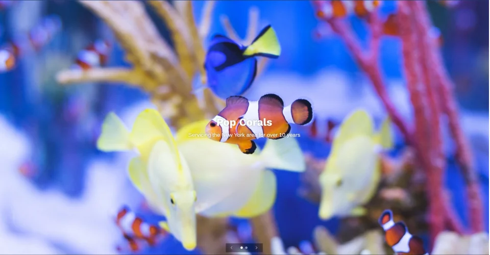
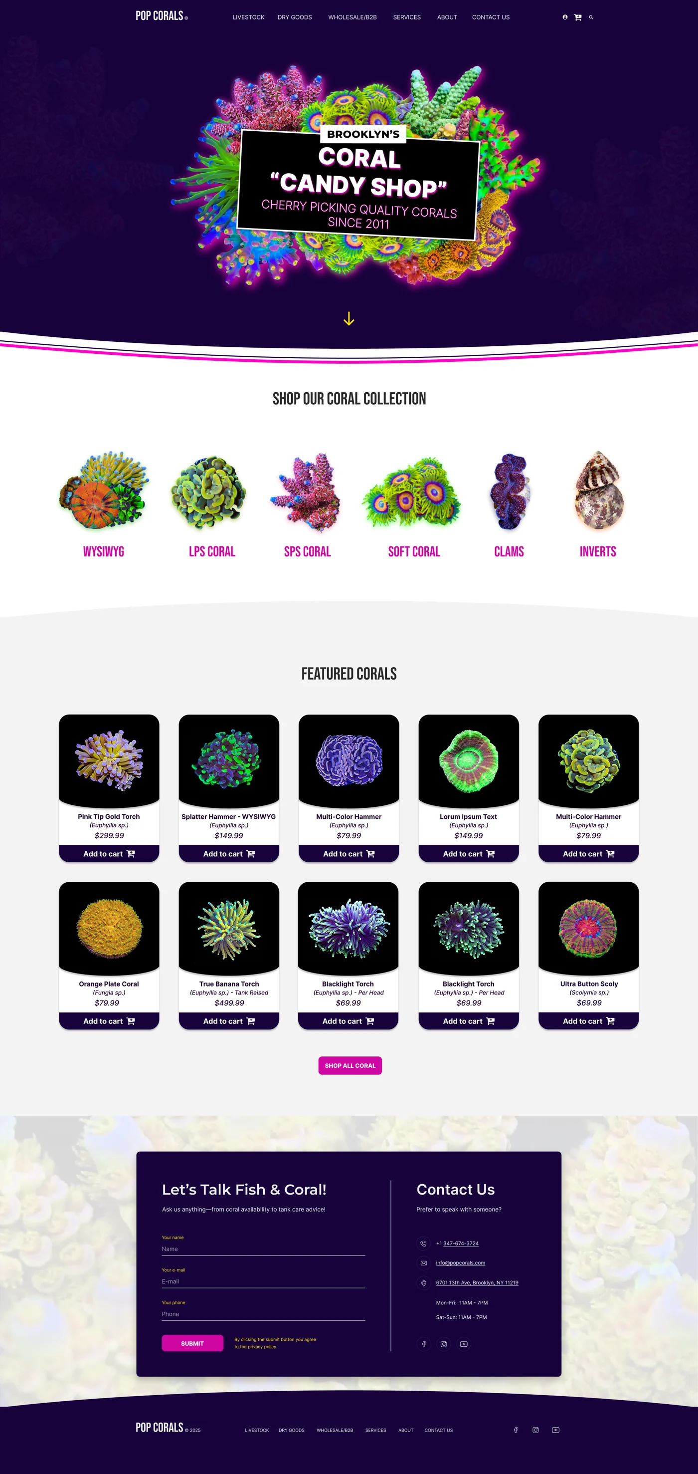
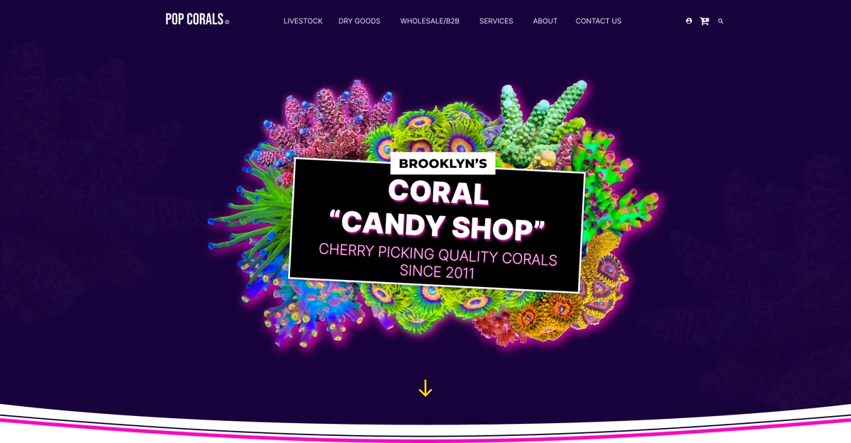
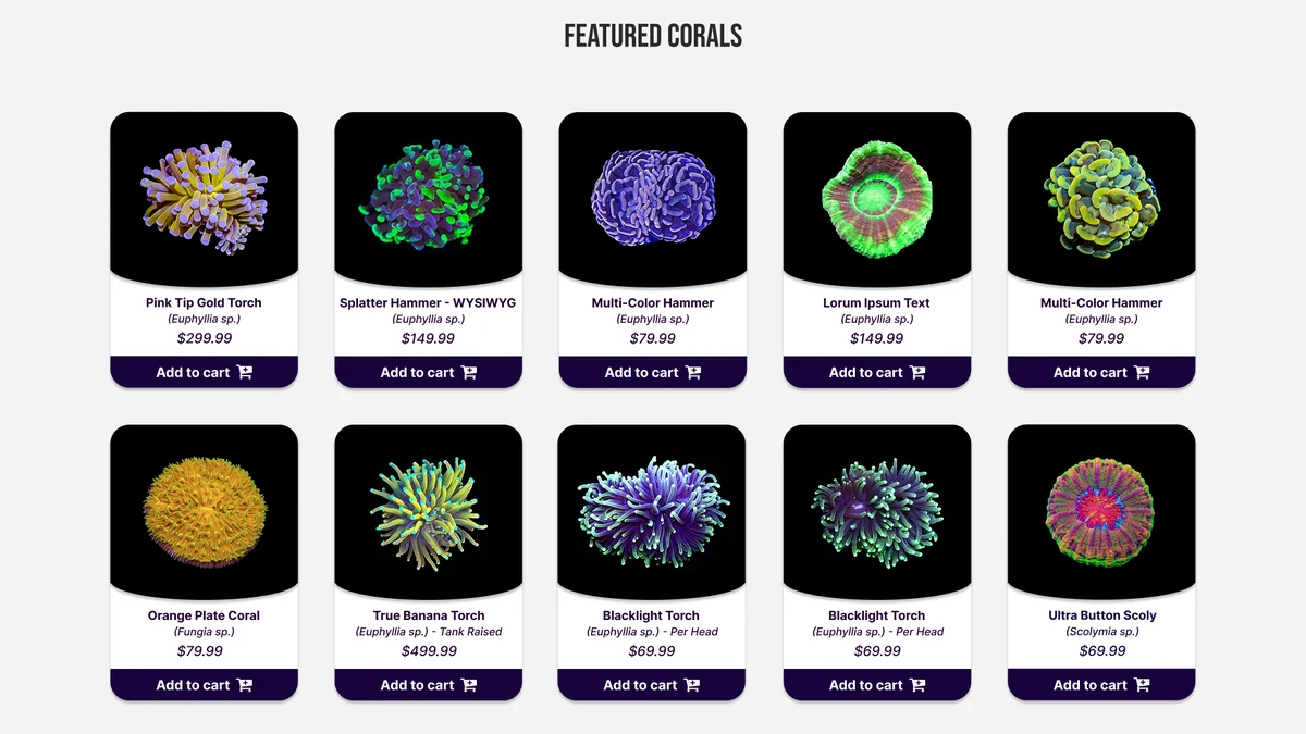
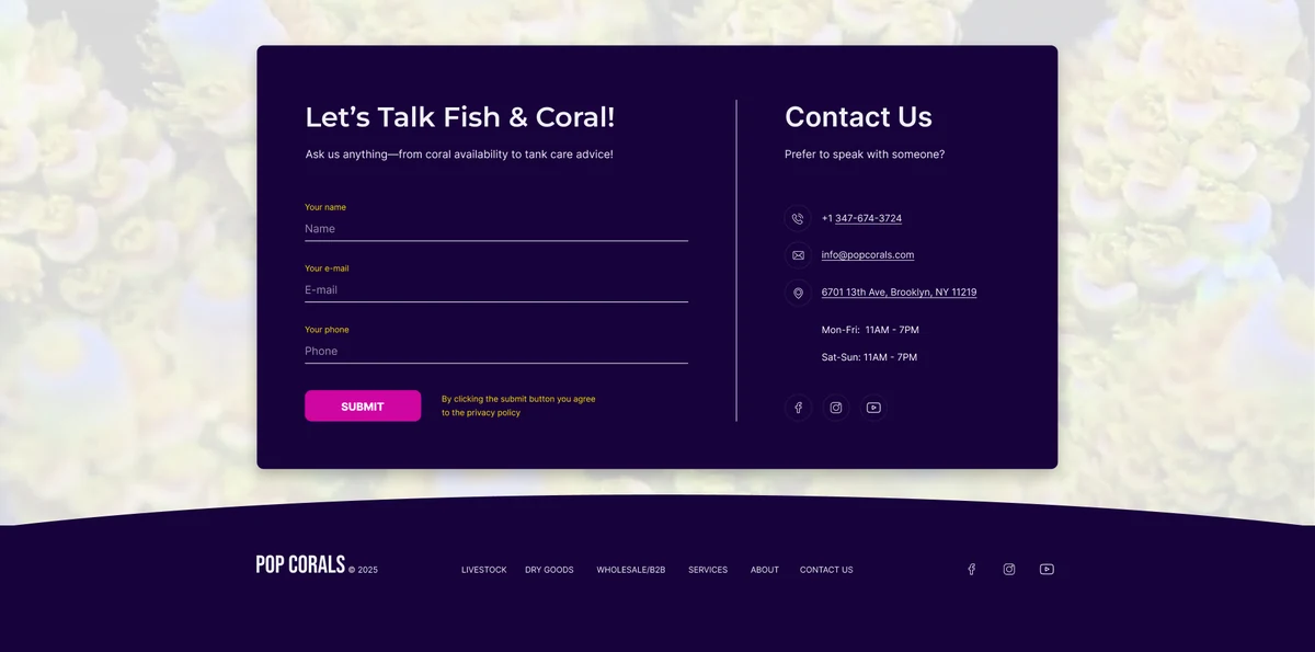
The same seven decisions, carried through to the storefront Pop Corals runs now: a banner built from the corals, six categories, one card format, and a contact panel doing the work the newsletter box used to.
Banner, categories, featured corals, contact


Validating iteration 1
That the design was still following the needs of the two personas established at the beginning — and that those needs stayed at the forefront through completion.
Secondary user testing was conducted to validate the design solutions implemented in iteration 1 of the redesign. Five users took part in post-test interviews, which prompted the following insights.
Straight forward and easy to navigate. There’s a whimsical element to it that I love! Corals seem to POP off the page, making it unique.Round 2
This feels like a one-stop shop. Just like walking into my LFS and picking up all of the essentials.Round 2
What an explosion of color! I can see why they’re called Pop Corals.Round 2
Easy to navigate and find what I was looking for. My only wish is that the featured items had an ‘Add to Cart’ feature.Round 2
Round 2 asked for one thing the mockup didn’t have: a way to buy from the featured grid without leaving it. Every card on the storefront now carries its own Add to cart.
What a week with a brand teaches you
This was my first web redesign concept, and with that came lessons along the way. First and foremost: capturing the essence of a brand without counteracting the presence it had already established in the market. My role was to engage current brand-loyal users and convert new ones.
Building for the end user, and not simply the business, was important to establish early. It can be difficult in our design infancy to establish that with stakeholders, but overcoming that challenge ultimately allows for a stronger design solution — one that favors both the user and, in turn, the business.
An additional design sprint to ensure all feedback from users has been implemented into the final mockups. Once that sprint is complete and reporting finalized, a final mockup is presented to the stakeholder for project handoff to the site developer.
The storefront on plate 10 is where that handoff landed — and where the round 2 request for Add to cart finally lives.